Purple Design System
Team member in building a company’s first Design System
Deliverable
Design System
Team
3 Product Designers
Client
Upside Business Travel
Date
01/2021-08/2021
Overview
Problem Definition & Context
Upside Design Team made the change to work in Figma in the beginning of 2021. As we were bringing over Sketch files into Figma, we realized that the Library from Sketch was not very comprehensive or congruous.
Myself and 2 other product designers started to have meetings with designers and developers to learn about the process and pain-points of shipping a product. Besides the lack of components and organization, we learned that there was a lot of inconsistency with the designs and code. There was a lot of discordant implementation. We suggested to create our first Design System, a universal language that would benefit designers and developers.
Approach & Solution
To create a universal language for designers + developers!
1. Styles, components, patterns, and pages in Figma.
Patterns are a solution for a commonly reoccurring problem. Having a framework available would save designers time - so they do not have to constantly rebuild repeating elements and can focus their time on problem solving. Our approach was to build from the ground up, similar idea of Atomic design, but more compatible to our elements and building blocks of design.
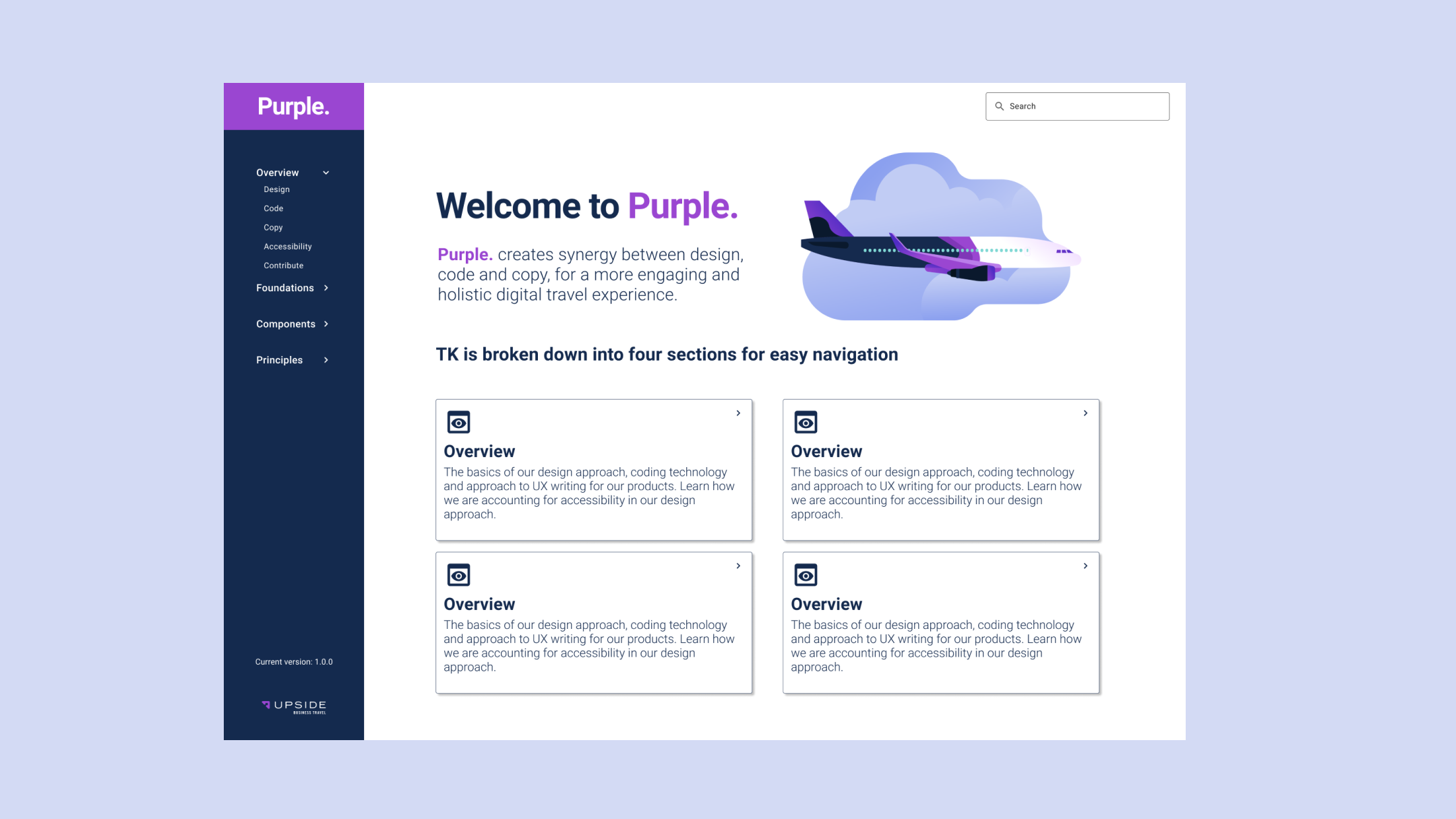
2. A documentation site.
The main goal here is consistency. This site would bridge the gap in understanding between designers and engineers while streamlining hand-off to developers. Engineers currently use Material UI, though there is still a lot of hard coding done. A later phase of this project would be to break off from a structured design framework, such as Material UI, and establish our own.
3. A standard for adoption and measuring success.
The Design System is a tool designers and developers will be using. How do we know if what we are building is helpful? If designers are using components correctly? How do we create a method of creating new components? All of these are questions we would constantly ask in our guild of the Design Systems Team. Though we did not get a chance to implement these next steps of adoption, it was something we found very important in keeping our system useful and functional.
Customer & Business Impact
Have a universal place of design and code consistency
Create a way to easily work on "white label" product
Designers will save time wireframing and Engineers will save time coding!
My Role
Team member in a group of 3 Product Designers.
This grew into a small team of Designers and Engineers. We were advocating for a Product Manager to join our guild but did not have the bandwidth at the time. So we took it upon ourselves to set goals and timeframes to measure our success.
Research
BRAINSTORMING & IDEATING
Listening to the pain points of Designers and Developers was the first step in understanding the problems we needed to solve.
““My designs aren’t being deciphered correctly. When I am looking for a component, I am not sure where to find the correct one and the standard styling information.””
““I implement the designs I am given, but they do not always adhere to what is available in the system.I often hardcode items when I don’t have time to find the best solution.””
READING & CONCEPTUALIZING
We wanted to become more knowledgable on how Design Systems are built. Through the process of Atomic Design we structured Purple around the concept of building smaller pieces to form components and templates.
What we did different was structure our system according to our product and vision. The best way to do this was through the different personas and customer journeys our user and product goes through to achieve their goal.
So how do we formulate our component library?


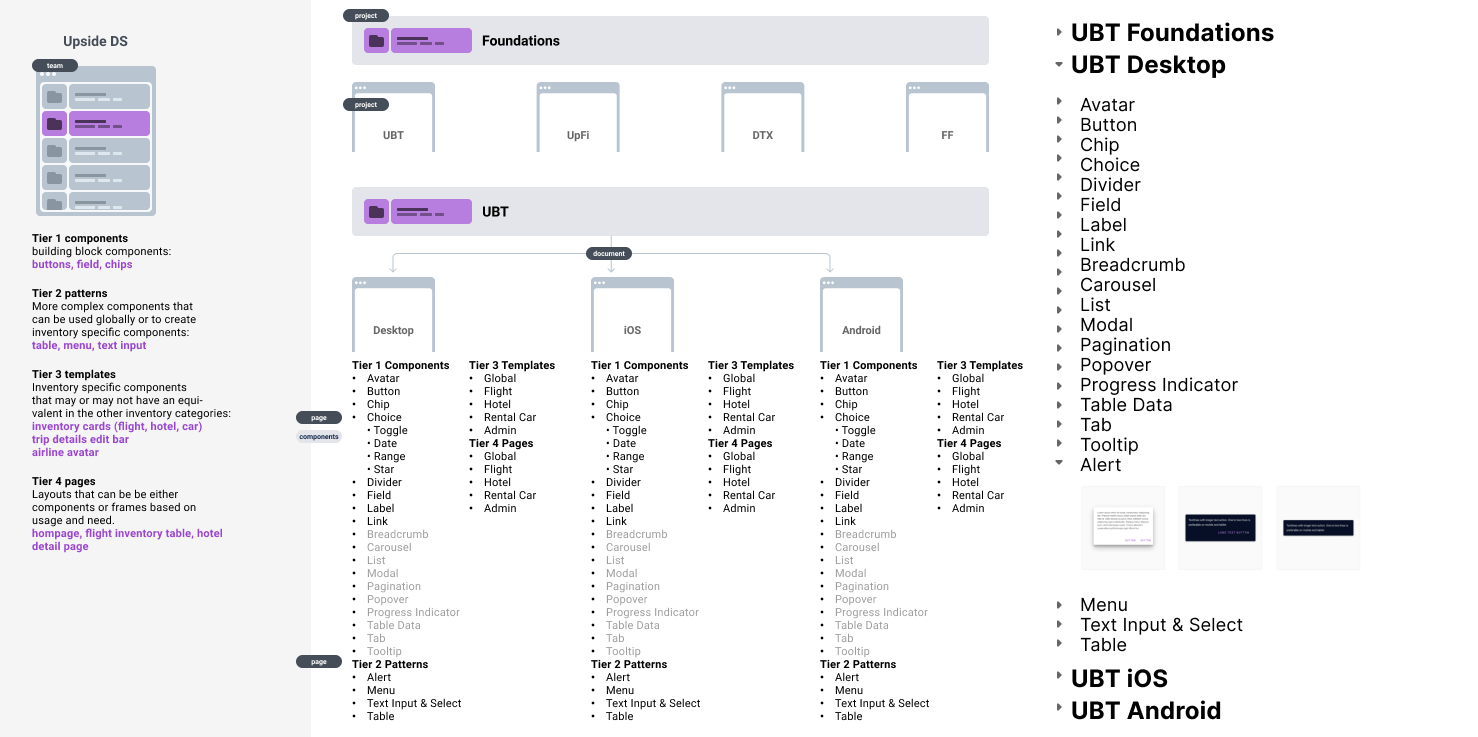
Component Library
We decided to organize our component library through a workflow of “jobs to be done.”
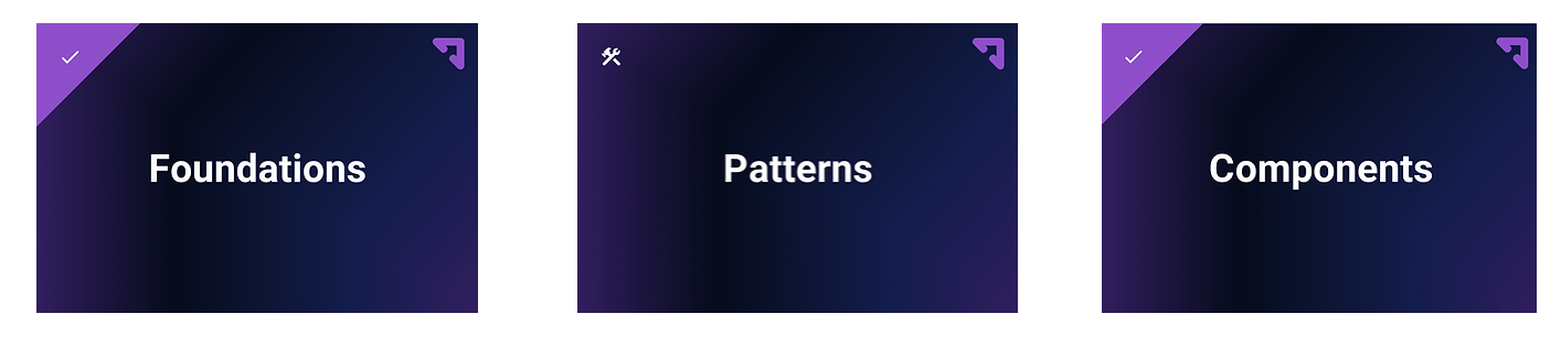
Foundations - the styles and assets that defines our product
Components - the building blocks of our patterns
Patterns - larger components and templates
TEMPLATES
NAVIGATION
global (layout • header • footer)
in page navigation
SHOPPING
trip search
flight
hotel
rental car
CHECKOUT
right rail
review
purchase
itinerary
MANAGE
trips
reporting
settings
profile
people
preferences
company settings
TRIP SEARCH TEMPLATE
FLIGHT SEARCH TEMPLATE
When building complex components…
This was the most in depth Figma file. I focused heavily on this file along with another designer. We spent a lot of time taking screen shots and documenting every page and instance a persona would encounter on the website. We also spent a lot of time inspecting the website, making sure we established consistent spacing and sizing. It was important to keep everything spaced on our 8 point grid.
Components are built with a key component, which makes it easier to add and edit when a new variation is added.
We also have made it a habit to name every layer. Yes this can take time, but its so important to build things correctly. This also allows other designers to understand how components are built and makes it easier to turn any layers off and on.
Documentation Site
A team member in the Design System Guild led the brainstorming and wire-framing for the documentation site. I assisted in feedback and ideating. Below are some examples of our brainstorming and sketches.
Documentation sites are an essential part of the Design System product. It enables your system to progress and is your manual! Without any instructions it really limits how many people can benefit from your component library. It really creates the design language and is also so important as we are working remotely.
We asked the team :
What are our goals?
Who is our audience?
What is the proposed content and how do we phase releases? (What is our MVP)
What are our questions and blockers?
Who is our inspiration?
Accessibility
Accessibility testing plays a key part throughout the entire development life cycle. It should never be an afterthought. Making sure a Design System is accessible means to audit both the designs and the code, from an atomic level to an organism level.
My plan for Accessibility auditing:
Have a meeting with the Director of Design and figure out how we want our company to represent accessibility - where do we want to be in terms of compliance.
In order for the testing process to be effective, this was my plan for auditing :
Define the scope of the evaluation
Conduct automated tests and manual tests
Document all findings in a detailed report
Plan for remediation based on findings from tests
Conduct regression testing to evaluate fixes
Test alongside with people who have disabilities (test for all people)
*Unfortunately I did not get to implement this plan at Upside at this time.
Reflections
Have a set of rules and implementation guidelines
User Testing, User Testing... and more testing!
Plan for adoption
Create Jira tickets and plan out release of the documentation website, Purple
Accessibility audit and plan for company
More resources, open hours, surveys
Create a dedicated team
As you can see there are a lot of next steps for this product. Sadly, Upside Business Travel had to close down at the end of September, so we did not get to move forward with our dream Design System Team.
I learned so much from working on this product and it really opened up my excitement to become more involved with a Design System team. It also helped find a great fit for my passion of Accessibility with my new enthusiasm for building Design Systems. The most important work I can do as an Accessibility Designer is to make sure the foundations of a product are built in with accessibility. You really become part of a very special guild when on a Design System's team and I cant wait for my next adventure!
Reach out if you would like to hear about the presentations I gave on accessibility in regards to Upside's product. Accessibility is a collaborative effort. Design and developers need to be working together to make accessibility a major role (especially when implementing a Design System.)